Monday, August 17, 2009

Beach day!


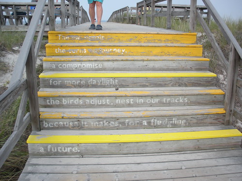
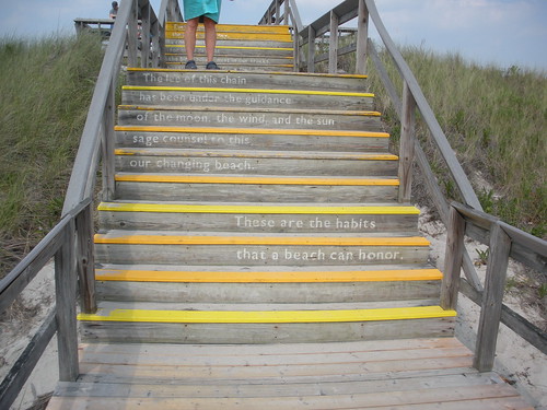
I went to the beach today and had to stop and take a picture of this. It was pretty awesome.

Thursday, July 30, 2009

A typeface that uses 20% less toner...


Can it have an effect on the environment? Is it good looking? Does it matter?

Wednesday, July 29, 2009

typesetting book fail


particularly great are the comments, especially those starting here:
http://failblog.org/2008/12/27/proof-of-concept-fail/#comment-221094

Friday, June 26, 2009

History by Peter Bilak


History, a typeface design by Peter Bilak
that, like Matthew Carter's Walker and Just van Rossum and Erik van Blokland's Beowulf, is characterized by its mutability—prone to change—unlike the tradition of stability in typeface design. 

Saturday, May 30, 2009

Wednesday, May 20, 2009

Minimum font-size for credit card fine-print

The new US credit-card bill specifies a minimum type-size and a list of approved fonts for the terms and conditions, to replace the mind-clouding teeny-weeny eye-strain-o-rama font that normally fills a Bible-sized tome that accompanies your standard credit card.
Section 122 of the Truth in Lending Act (U.S.C. 1632) is amended by adding at the end the following new subsection:

"(d) Minimum type-size and font requirement for credit card applications and disclosures. -All written information, provisions, and terms in or on any application, solicitation, contract, or agreement for any credit card account under an open end consumer credit plan, and all written information included in or on any disclosure required under this chapter with respect to any such account, shall appear-

"(1) in not less than 12-point type; and

"(2) in any font other than a font which the Board has designated, in regulations under this section, as a font that inhibits readability.".


ripped from boing boing.

Tuesday, May 5, 2009

Sunday, April 26, 2009

Colophons


Remember to design a space in your pamphlet for a colophon or 'printers' mark.'.


À la Carte


Thanks to William, Jackie, James, Anna, and Jeannie for extra work Saturday morning.

All cards are printed and cut - final assembly in class Monday.

Friday, April 24, 2009

Portfolios Due May 8 at Noon


After seeing these 11x17" sheets some of you made for our meetings I've decided to make this the format for your portfolio of work completed this semester. Please produce 2-3 11 x 17" (portrait, color, 1-sided) pages with examples of all projects - save as a .pdf in Course Folder > Portfolios, and print 1 set to turn in at the crit on May 8. 

Monday, April 20, 2009

Hey, all. XpedX is awesome, cheap, and is easy to get to.

For reference, their website is here.

If you're incredibly inspired, French papers and Mohawk papers are always very very nice, but you'll end up ordering more and have to wait a while for the shipping. That said, they have some fantastic papers that might work well for covers, if you're so inclined. You order Mohawk through the Strathmore website (how incestuous!) which also has some nice papers.

Happy printing!

Tuesday, April 14, 2009

Designer's Site With Stitched Book Project

Click here.

Typographic Space Still a Problem at DP


Space between the R and A reveals that DP still practicing poor typographic judgement.


Monday, April 13, 2009

DP Guilty of Typographic Offense


To Michael Gold, Design Editor at the Daily Pennsylvanian:

Dear Michael

We, the students and faculty of FNAR 266, Typography, are outraged by the negative letter spacing in the headline "Prof will join admin" on the cover of the April 13 issue. 

These letters need space! Your  kerning—it must be minus 100—is unacceptable! Typography is primarily about space: page space, word space, line space and yes, letter space! Someone needs to speak out for the space between letters and we, the members of this class, demand that the quality journalism you practice extend to the design you produce.

Sincerely, the students and faculty of FNAR 266, Typography.

Milton Glaser: How great design makes ideas new

Jacek Utko: Can design save the newspaper?

Flickr pools


If you're looking for some interesting typography, there are a lot of Flickr photo pools that people submit images to. Bittbox.com collects some of these in an entry titled "17 Stimulating Flickr Groups to get You Typographically Inspired." So, if you're looking for a little inspiration, you should check these out.

Sunday, April 12, 2009

Wednesday, April 1, 2009

New Dollar Sign Proposed by Congress to Reflect Economic Conditions


WASHINGTON D.C. — APRIL 1, 2009
To help stem the downward spiral of the United States economy Congress has proposed a new dollar symbol.


“Updating fonts on the world’s computers and devices would be a huge economic stimulus” said one representative after a late night session of the newly formed House Subcommittee – Font Economic Stimulus Technology Relief (FESTR). “The dollar is a shadow of its former self and the new design reflects this.”

Officials with the International Currency Authority were notified of the change and agreed that other currencies should be updated to aid other countries feeling the effects of the economic debacle.

To move forward quickly, Ascender Corporation (Elk Grove Village, IL) has been granted TARP money to begin production on, what it calls, “shovel ready” font designs. FESTR reviewed hundreds of submissions and selected the design for the New Dollar sign by Ascender’s Steve Matteson for its formulaic simplicity and visual clarity..

To be consistent with the value of the world’s currencies, Ascender is offering the new currency symbols at half-off. For more information on the new currency symbols visit www.ascendercorp.com/custom/currency/

Typography articles

Click here for a great website/resource for typography articles.

Tuesday, March 31, 2009

A Couple of Great Posters Using Type Only

R2D2 in Helvetica (via link)


NYC (via link)


WTC (via link)

Monday, March 30, 2009

Trajan is the Movie Font

Funny video I saw a while back that I just remembered about.


Project 3


From the top:

Design review
Printing fun
Setting up the press
Setting type
Recipe research

Saturday, March 28, 2009

Designing The Book Cover for "Columbine"

A wonderful post about the process of designing a book cover for a very charged subject.

Thursday, March 26, 2009

Kinetic Type

Pretty good archive of kinetic type in this blog post—

Here. Be sure not to miss the Full Metal Jacket one.

Vecteezy.com

Great resource for free vector images: link

See also: Brusheezy and Flasheezy

Wednesday, March 25, 2009

Due Now


Those who haven't paid must do so Monday 9am.

Essays on Typography


Here is another site for some texts you might want to use for project 4: Emigre, the great type and graphic design studio and publisher of the influential Emigre magazine.

Scribd

For those looking for text for Project 4. Scribd has a ton of pdfs of books, stories, & essays. All free. 

Nuns and Printmaking


Sister Mary Corita was a nun who, in the 1960s and 70s, designed a whole bunch of pretty awesome posters.

You should check out here work here and here.

Also, GoogleImages will probably help you out.

In any case, you should definitely look in to her work.

Recipe Pin-Up


Pictures from the crit of our recipe card designs.