Thursday, February 26, 2009

more funny statements


These were painted (?). Acrylic on paper says the site.
(Via thebeholder)

New Math

Math + Words =

(via MoreNewMath)

Wednesday, February 25, 2009

The Crisis of Credit Visualized

Brilliant motion graphic video using kinetic typography and simple symbols to explain the credit crisis. I finally understand.

HD Version: link

Jackie Casey and her MIT Posters


Jackie Casey was, for many years in the 1970s and 80s, a designer at the Massachusetts Institute of Technology in Cambridge, MA. She developed a minimalist typographic approach to the many art and technology poster projects that came through the university publications office. Here's a link to her work. And a link to a Flickr collection.

Tuesday, February 24, 2009

Color Palette Generator


There's lots of them out there.
This one's cool cause it lets you upload a photo and generate the palette from that. So you can upload you favorite classical art piece, where masters have spent their entire lives studying color and what works well together, and yoink their color choices.
http://www.cssdrive.com/imagepalette/index.php

Monday, February 23, 2009

New Snapple Labels

Check out the old label:versus the new:
The cap on the new bottle still uses the old typeface, but the new label no longer has the name slanted upward, and the typeface is more rounded and "sunshine-y," without the illustration of the sun above it.

TEXTURES!

 
So I got a lot of questions about textures today, and I figured I would share some of places I go to get some raw materials for texture/pattern construction:

http://www.bluevertigo.com.ar/bluevertigo.htm

This has a whole collection of different resources including stock photo sites, texture resources, etc. Be aware though that these include "web" depots, so the resource files might be at a lower resolution (72 ppi) as opposed to 300 ppi. There are a lot of sites that are applicable to print however, you just have to dig around for them. 

http://www.lostandtaken.com/

This is a high res image resource in which you can acquire paint, paper, asphalt textures. The dpi varies depending on the contributors. The highest it goes to I think is 180 dpi. But the actual PIXEL size of the images is usually large enough that you can resample the image in photoshop to 220-300 ppi while maintaining a decent size (i.e. 8.5 x 11). Moral of the story: ALWAYS CHECK the dpi before you apply any of these resources to your projects. 

http://www.bittbox.com/

This site is pretty cheesy, and I don't really use it for anything other than acquiring high res(Size 2250)  photoshop brushes that can be used to add your own personal touches to textures/images created in photoshop. 

Happy hunting, and hope that helps! 


Thursday, February 19, 2009

German Bank Notes


A flickr with examples of German bank notes. Interesting examples of typography. Thanks Peter.

2x4


2x4 is a multidisciplinary studio focusing on design for art, architecture, fashion and cultural clients. Click here for a profile produced by Apple.

Josef Muller-Brockmann


A display of typographic posters by Muller-Brockmann, a leading Swiss designer associated with the modernist, post-war movement of the International Typographic Style.

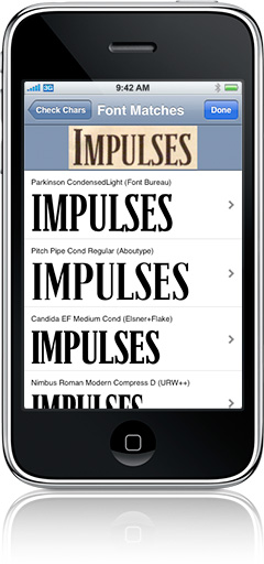
For those of you with iPhones


Now, I don't have an iPhone, but the two applications in this post are the most compelling reasons I've seen to get one. The first one is a game called "Descender" and it's all about putting letters in where they go ought to go. Okay, so it's basically like Brick or Snood, but look at how pretty that Helvetica is! And a type snob joke? You really can't lose. More about the application can be found here.


This one is way more practical. It's pretty much a portable Identifont, except it can do it visually instead of you describing what various parts of characters look like. Now that one is neat. Click here to learn more.

Snazzy typographic illustration


This guy is and illustrator/graphic designer with some really nice illustrations mixing drawings with type.

The Book Cover Archive


Tons of book covers, selected for their designs here.

found here.

Wednesday, February 18, 2009

Lettering can be powerful


This is the poster I described in class—hand painted, about 30x40". The Dean thought it was so offensive that he took it down after it was installed in the lobby of the School of Art. More signs here.

grammar of ornament


A very large digital image library or ornament!

Troxler

Troxler

Tuesday, February 17, 2009

Two pretty nifty links!

The first is a brief pictoral history on the Arabic printing press, which is pretty awesome and probably an enormous headache, given all of the diacriticals necessary in Arabic.

The second link is to another blog for a Typography class, which is pretty neat and gives you a different example of a typography syllabus. The blog seems to be mainly for the purpose of posting assignments and relevant information for the class, so it should give you a pretty good perspective on another way to learn about type.

Cheers! See you all tomorrow!

The Arabic Printing Press

Jeremy Botts' Typography 1 Class Blog

Links via Comberg

"Books Worth Buying for Their Cover"


Let's hear it for the book designers. For every Milan Kundera, Jeffrey Eugenides and Aldous Huxley, there is a Roberto de Vicq de Cumptich, a Leah Carlson-Stanisic and a Gregg Kulick – all designers of memorable cover art. They give a visual perspective to somebody else's written art, find balance in color and shape, simplicity and uniqueness. A book must stand out on the bookstore bookshelf yet cover designers rarely receive the recognition that authors do. In appreciation of these unsung artists, here are 30 of my favorite fiction covers – all worth buying for the cover alone.
covers here.
(thanks Mordechai)

Sunday, February 15, 2009

NYTimes Typefaces


From today's Magazine.

Friday, February 13, 2009

TheDieline.com


TheDieline.com
is a package design blog that posts some pretty nifty looking things. I don't know about the rest of you, but sometimes how pretty the packaging is for products seriously influences whether I buy them. These are two such designs that I thought were pretty relevant, given their typographic nature.


Thursday, February 12, 2009

The Onion on Dadaism

from here:

Hard To Tell If Wikipedia Entry On Dada Has Been Vandalized Or Not

August 20, 2007

ZURICH, SWITZERLAND—The Wikipedia entry on Dada—the World War I–era "anti-art" movement characterized by random nonsense words, bizarre photocollage, and the repurposing of pre-existing material to strange and disturbing effect—may or may not have been severely vandalized, sources said Monday.

"This is either totally messed up or completely accurate," said Reed College art history major Ted Brendon. "There's a mustache drawn on the photo of Marcel Duchamp, the font size keeps changing, and halfway through, the type starts going in a circle. Also, the majority of the actual entry is made up of Krazy Kat cartoons with abstract poetry written in the dialogue balloons."

The fact that the web page continually reverts to a "normal" state, observers say, is either evidence that ongoing vandalization is being deleted through vigilant updating, or a deliberate statement on the impermanence of superficial petit-bourgeois culture in the age of modernity.

Wednesday, February 11, 2009

GRAMMY AD CAMPAIGN

Noticed this series of Grammy advertisements that go for the whole type montage effect. Thoughts? 

see here for more details: www.thind.com/content/view/3701/1116/


classical music can be cool


One more book jacket designer for you all, Will Staehle, known as LoneWolfBlackSheep.

Today is just a day filled with links.

Check this guy out: http://www.apeloig.com/index.php

Courtesy of Ashley, this guy has a bunch of really interesting posters, fonts he's made, and design work.

Another new link--

http://www.typographicposters.com/

Both of the links just posted are now in the web resources on the right navigation menu.

New Site!

http://typornography.blogspot.com/

Ok, one more


Very cool site on book cover designs and interviews with designers. Click here.

More covers


I just spent a whole bunch of time looking and thinking about these book covers collected by Smashing Magazine. You might find them helpful too. 


barcode generator


generate barcodes: www.barcoding.com/upc

right click (ctrl-click) to save high quality version

A Tree of Authors

I was researching on my publisher (Ecco) and came across their cover for a Christmas anthology in 2006. 

Tuesday, February 10, 2009

now that we've seen Helvetica


Helbotica t-shirts. 

Typography clothing

there's tons of it out there, but here are some good ones that come to mind:


and the ever excellent KERN:

which reminds me of:

if you give a typography student a blog post...

Monday, February 9, 2009

Good Old Fashioned


I saw this on Saturday and was enamored of the hand-carved typeset look. Especially refreshing after the onslaught of perfect type seen in Helvetica this morning!

Sunday, February 8, 2009

Saturday, February 7, 2009

http://www-personal.umich.edu/~thyliasm/coexist.gif

the possibilities seem endless

this site may have more to do with design layout, but click through and browse the various takes on organizing and presenting the same information and how type is used to present and reflect a particular theme.

http://www.mezzoblue.com/zengarden/alldesigns/

Wednesday, February 4, 2009

Powerful Typography

389 Years Ago
Thought this was a very powerful poster created using typography.

Tuesday, February 3, 2009

Invest in a girl, and she'll do the rest

A friend sent this animation to me. It draws on typographic techniques to convey the point. I'm no feminist (nor anti-feminist), but interesting point raised here. 

Monday, February 2, 2009

Book Design


I think book cover designs are really interesting examples of the use of type. Here are a few examples of this blog's favorite covers from 2008.


Here are a few of my favorite book covers (not of any particular year).


And now everyone knows what I read. Eep.